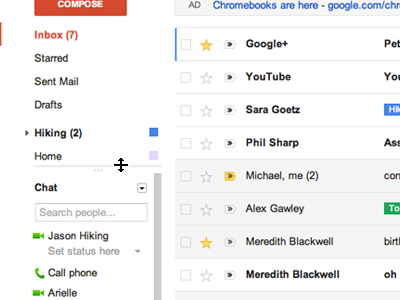
Today Google unveiled a new look for its free email service.
Here is how one of the new theme looks like :
The new layout has a revamped "conversation view" to make it easier to keep track of who said what in email trails and improved tools for searching mailboxes, which typically serve as storage bins for users.
Here is how one of the new theme looks like :
Explore the brand new themes and customize the look of Gmail.
Conversations have been redesigned to bring the content of your messages to the forefront, and profile pictures make it easier to see who you’re talking with at a glance.
Conversations have been redesigned to bring the content of your messages to the forefront, and profile pictures make it easier to see who you’re talking with at a glance.
You can now choose how many messages are on your screen at a time by choosing from three different display densities: Comfortable, Cozy and Compact
And you also have more control over the size of your chat window. Just drag it to the desired size
The new search box makes it easy to customize your search and find exactly what you’re looking for. You can also create a filter right from the same place
You can switch to Gmail's new look by just clicking on " Switch to new look " . Which is situated in upper right corner :)
Credits : Gmail Official Site
Thanks :)
You can switch to Gmail's new look by just clicking on " Switch to new look " . Which is situated in upper right corner :)
Credits : Gmail Official Site
Thanks :)


It is simply making all products look like Google Plus...The identity of each product has now disappeared.
ReplyDeleteRegards
village girl
latest updates ...nice:)
ReplyDeleteHair Hair Hair